14 Apr 2016
One slightly strange and irritating issue with Count The Days Left is the app has a small but noticeable delay on startup.
I added a ton of instrumentation to help figure out what was going on, and was then able to make some micro-improvements which have helped a little. However this small decrease in loading time makes the app FEEL a lot quicker on startup.
Changes made:
- Move the Watch communication initialization code off a background queue onto the main thread
- Removed an additional and unnecessary call to update the badge number
- Moved updating of control settings into viewDidAppear() from viewWillAppear()
- Optimised watch app view updating logic to do minimum work necessary
The first point was unexpected, but after measuring the actual speed of the code the overhead of spinning up a new thread and running code in parallel was not actually worth doing. As ever, measurement trumps expected outcomes.
The third point clearly didn’t really any difference to the amount of code to be run, but perception is all and it feels a little faster.
The final point is obvious - the Apple Watch is very underpowered, so doing the absolute minimum amount of work at all times is essential.
Summary
The startup time is still a little slow - and my unproven suspicion is that Swift apps take a little longer to initialise in general anyway - but I’m a lot happier with it now.
As ever, more details can be found on the GitHub repository where all the code for the app lives.
I’ve just submitted v2.0.3 to the App Store for review, so unless we have any shenanigans as before hopefully it will be available in the next few days.
16 Mar 2016
The latest version of Daily Optimiser - v3.0.1 - is now available on the App Store.
The release notes sound like the standard big company response:
A few small bug fixes and minor performance improvements
However to be honest that’s all I’ve done! I’ve fixed a few minor UI issues I’d missed in the original 3.0 release, and removed a little bit
of code to make things marginally quicker.
Enjoy!
29 Feb 2016
I’ve got multiple sites that I develop and host - sites for my mobile apps,
my artist friend Josie’s website, my company website and other bits
and pieces I’ve built over the years.
For a couple of years I’ve using A Small Orange as a hosting service. They’ve been very good, and
if you’re looking for an inexpensive shared host with excellent reliability, I’d definitely recommend them.
However my yearly renewal was due, so I decided to take the plunge and move over to running my own virtual server with Digital Ocean.
I’ve been doing a lot more work on Unix systems recently, so I’m reasonably confident I mostly know what I’m doing. There are lots of
useful guides at Digital Ocean to help you out, and I now have a working nginx server serving all of my sites, plus PostFix running as a mail forwarder.
I also ported my company website from a Python Google App Engine site to a static Jekyll one, and am hosting
this on my own server now too.
I’m very happy I’m now in complete control of serving all my sites exactly how I want to.
Also it was quite fun setting up an Ubuntu server up from scratch exactly how I wanted it. I wouldn’t have said that a few years ago!
07 Feb 2016
So I finally made some progress after my rant last time
and I’ve finally released the latest version of Count The Days Left
to the App Store.
What I changed
The “problem” was that the watch complication was deemed too similar to the battery complication. This was
because it’s using the CLKComplicationTemplateCircularSmallRingText template
that is one of the few - and pretty restricted - template options available to a developer
Here’s a screenshot from my watch, with the battery complication in the center and the “problem” Count The Days Left one on the right:
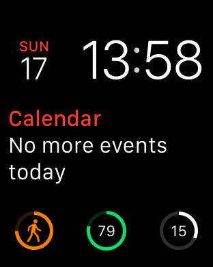
I decided to make the most minimal change possible - simply change the style of the progress ring from Closed to Open
If you look closely, you can see the massive difference this made below:
I think this is actually a better choice, as the very small “open” gap at the bottom of the circle matches the main UI.
Anyway after a worrying delay of 3-4 days while the app was “In Review”, the change was accepted and version 2.0.2 has
FINALLY been released!
Moral of the story is …
Never underestimate how crazy the app approval process can be!
Links
17 Jan 2016
I’ve not been able to release the changes to Count The Days Left mentioned in
my last post because of a very frustrating review from Apple’s App Store reviewers.
Review feedback
After waiting over a week for the new version to be reviewed, I received notification that it had been rejected. I assumed
this was because of the Xcode bug I documented in the last post,
but it was actually the following:
8.3 - Apps that appear confusingly similar to an existing Apple product, interface, or advertising theme will be rejected
8.3 Details: Your Apple Watch app contains features that mimic native iOS interfaces or behaviors.
Specifically, the Complication used for your Apple Watch app mimics that of the native ‘Battery’ Complication design and interface.
Next Steps:
Please revise these features to make them distinctly different from the iOS behaviors and interfaces to avoid causing user confusion.
Illogical
Now although the reasons given for the rejection are factually correct, they really don’t make any sense.
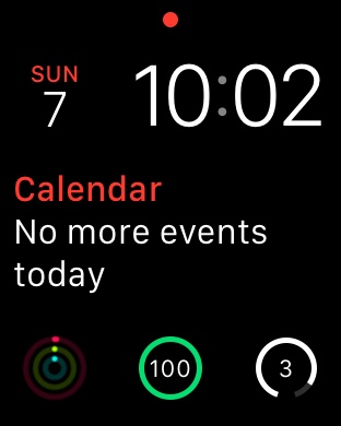
Here’s a screenshot from my watch, with the battery complication in the center and the Count The Days Left on the right:
However there is a very good reason it looks the same - it’s using the CLKComplicationTemplateCircularSmallRingText template
that is one of the few - and pretty restricted - template options available to a developer.
Almost certainly the battery level complication is using the same template, which makes a lot of sense. If you have a “progress” number you want to
show - which both the battery and my app do - this is the logical template to use.
Obviously if using this template in your app isn’t going to make it through an app store review, it doesn’t make any sense to allow
it in the complications SDK.
However the real answer is that using this complication shouldn’t be rejected by the reviewers. I’m obviously not trying to
pretend my app is a battery level complication, and when the user is selecting their complication which one is which (as you can see below):
It’s this level of over restriction of their platform that can make it very, very frustrating developing for Apple’s platforms.
I’m not advocating a free for all on allowed apps, and their needs to be quality control to not allow apps which abuse user’s data or the like.
However even the intent behind this rule doesn’t make any sense. The fact that my app’s complication looks like another one doesn’t harm
the user in any way at all, and if they want to use both at the same time then why shouldn’t they?
Inconsistent
If you’ve been following along as I’ve developed this app, you’ll have spotted the other flaw in Apple’s system.
The complication design hasn’t changed at all since the previous version which was deemed acceptable in previous reviews!
What to do next
I obviously appealed against the review to the App Store, giving the arguments I made above but it still got rejected.
I’m not sure how best to move forward now. I guess my options are:
- Resubmit the app again and hope this time I get a more favourable reviewer
- Change the complication so it looks differently, which will actually make the app less useful to its users
- Remove the complication from the app
- Give up, and just keep the improvements in the latest version for myself
Option 1 would be best, although it means waiting another week for a review with an unknown chance of success (probably low because I’ve already appealed)
Option 2 is what I may be forced to do, although it really pains me to make my app worse just to work around Apple’s incompetence
Option 3 would clearly make the app worse, and I know it’s a key feature for more than one user (including myself!)
Option 4 is where we are right now, and is where we’ll be until I find the energy to do something else :(
As you can probably tell, I’m not very happy on where this has ended up.
Links