
Inconsistent and Illogical App Store Review
17 Jan 2016I’ve not been able to release the changes to Count The Days Left mentioned in my last post because of a very frustrating review from Apple’s App Store reviewers.
Review feedback
After waiting over a week for the new version to be reviewed, I received notification that it had been rejected. I assumed this was because of the Xcode bug I documented in the last post, but it was actually the following:
8.3 - Apps that appear confusingly similar to an existing Apple product, interface, or advertising theme will be rejected
8.3 Details: Your Apple Watch app contains features that mimic native iOS interfaces or behaviors. Specifically, the Complication used for your Apple Watch app mimics that of the native ‘Battery’ Complication design and interface.
Next Steps: Please revise these features to make them distinctly different from the iOS behaviors and interfaces to avoid causing user confusion.
Illogical
Now although the reasons given for the rejection are factually correct, they really don’t make any sense.
Here’s a screenshot from my watch, with the battery complication in the center and the Count The Days Left on the right:
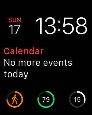
However there is a very good reason it looks the same - it’s using the CLKComplicationTemplateCircularSmallRingText template that is one of the few - and pretty restricted - template options available to a developer.
Almost certainly the battery level complication is using the same template, which makes a lot of sense. If you have a “progress” number you want to show - which both the battery and my app do - this is the logical template to use.
Obviously if using this template in your app isn’t going to make it through an app store review, it doesn’t make any sense to allow it in the complications SDK.
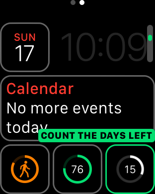
However the real answer is that using this complication shouldn’t be rejected by the reviewers. I’m obviously not trying to pretend my app is a battery level complication, and when the user is selecting their complication which one is which (as you can see below):
It’s this level of over restriction of their platform that can make it very, very frustrating developing for Apple’s platforms. I’m not advocating a free for all on allowed apps, and their needs to be quality control to not allow apps which abuse user’s data or the like.
However even the intent behind this rule doesn’t make any sense. The fact that my app’s complication looks like another one doesn’t harm the user in any way at all, and if they want to use both at the same time then why shouldn’t they?
Inconsistent
If you’ve been following along as I’ve developed this app, you’ll have spotted the other flaw in Apple’s system.
The complication design hasn’t changed at all since the previous version which was deemed acceptable in previous reviews!
What to do next
I obviously appealed against the review to the App Store, giving the arguments I made above but it still got rejected.
I’m not sure how best to move forward now. I guess my options are:
- Resubmit the app again and hope this time I get a more favourable reviewer
- Change the complication so it looks differently, which will actually make the app less useful to its users
- Remove the complication from the app
- Give up, and just keep the improvements in the latest version for myself
Option 1 would be best, although it means waiting another week for a review with an unknown chance of success (probably low because I’ve already appealed)
Option 2 is what I may be forced to do, although it really pains me to make my app worse just to work around Apple’s incompetence
Option 3 would clearly make the app worse, and I know it’s a key feature for more than one user (including myself!)
Option 4 is where we are right now, and is where we’ll be until I find the energy to do something else :(
As you can probably tell, I’m not very happy on where this has ended up.
Links
- Articles about Count The Days Left
- N.B. All code can be seen on GitHub