A Minor Change and we're through the App Store Review
07 Feb 2016So I finally made some progress after my rant last time and I’ve finally released the latest version of Count The Days Left to the App Store.
What I changed
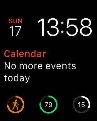
The “problem” was that the watch complication was deemed too similar to the battery complication. This was because it’s using the CLKComplicationTemplateCircularSmallRingText template that is one of the few - and pretty restricted - template options available to a developer
Here’s a screenshot from my watch, with the battery complication in the center and the “problem” Count The Days Left one on the right:

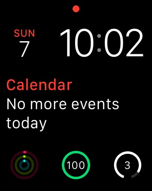
I decided to make the most minimal change possible - simply change the style of the progress ring from Closed to Open
If you look closely, you can see the massive difference this made below:

I think this is actually a better choice, as the very small “open” gap at the bottom of the circle matches the main UI.
Anyway after a worrying delay of 3-4 days while the app was “In Review”, the change was accepted and version 2.0.2 has FINALLY been released!
Moral of the story is …
Never underestimate how crazy the app approval process can be!
Links
- Articles about Count The Days Left
- N.B. All code can be seen on GitHub
