Refreshing the Daily Optimiser UI
26 Nov 2017Daily Optimiser is the first iOS app I ever wrote, and it’s been looking a little tired and out of date recently.
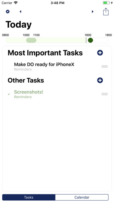
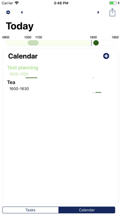
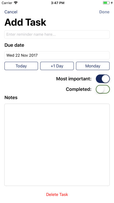
So last week I spent a few hours improving and modernising the UI, and I’m quite pleased with the results (there are some screenshots are at the end of the article).
I’ve tried to be more consistent and subtle with the use of font size and color to give the information a clear hierarchy.
What was more interesting was how much I’ve learnt in the last few years of doing iOS development. Looking back at the original code, it’s clear I was I had no clear idea how best to structure the code. I was also very inexperienced in autolayout, and used tables EVERYWHERE to build screens!
I’ve also made the app iOS11 only to take advantage of large titles in the UI, but from my analytics I can see hardly anyone is using the app any more, so it’s not going to aggravate a non-existent user base.
I must admit I don’t actually use Daily Optimiser, as I prefer Todoist over Reminders as my task organiser. However if you are looking for a simple app based around Calendars and Reminders to help you organise your day, why not give it a go?
Screenshots of Daily Optimiser 4.0


