Getting Ready to Ship Swift
14 Mar 2015
We’re getting close to shipping the app I’ve been blogging about, so there’s a few bugs to fix and housekeeping tasks to be done first, to get everything closer to production quality.
Switching back to Xcode 6.2
I couldn’t get the deployment tools working in Xcode 6.3 beta (not surprising I suppose), so I decided to switch the code back to the recently released Xcode 6.2.
This also meant changing the Swift code back to the previous version too which was a bit of a pain, but in reality all this meant was getting rid of the new - but slightly confusing IMHO - casting commands of as? and as!
The only other change was replacing the much improved count(string) function to get the length of a string with the rubbish countElements(string). Surely an extension method on the String class to get the length should be in the language (or have I missed something?)
You can see from the commit on GitHub the changes I made.
Integrating Fabric
I’ve also integrated Twitter’s Fabric framework for tracking bugs. They had a slightly strange installation program that’s somehow watched Xcode for builds, which doesn’t seem particularly reliable, but I think it’s now all set up correctly. Hopefully this relatively simple app won’t have any crashes, but good to know I should be able to diagnose them if it does.
Bug fixes
I’ve been using the app over the last week or so, and have made a few more improvements:
- Added a timer that fires at midnight each night and refreshes the view, just in case the app is running overnight and needs updating
- Picked a new color palette from paletton.com to tweak the color scheme
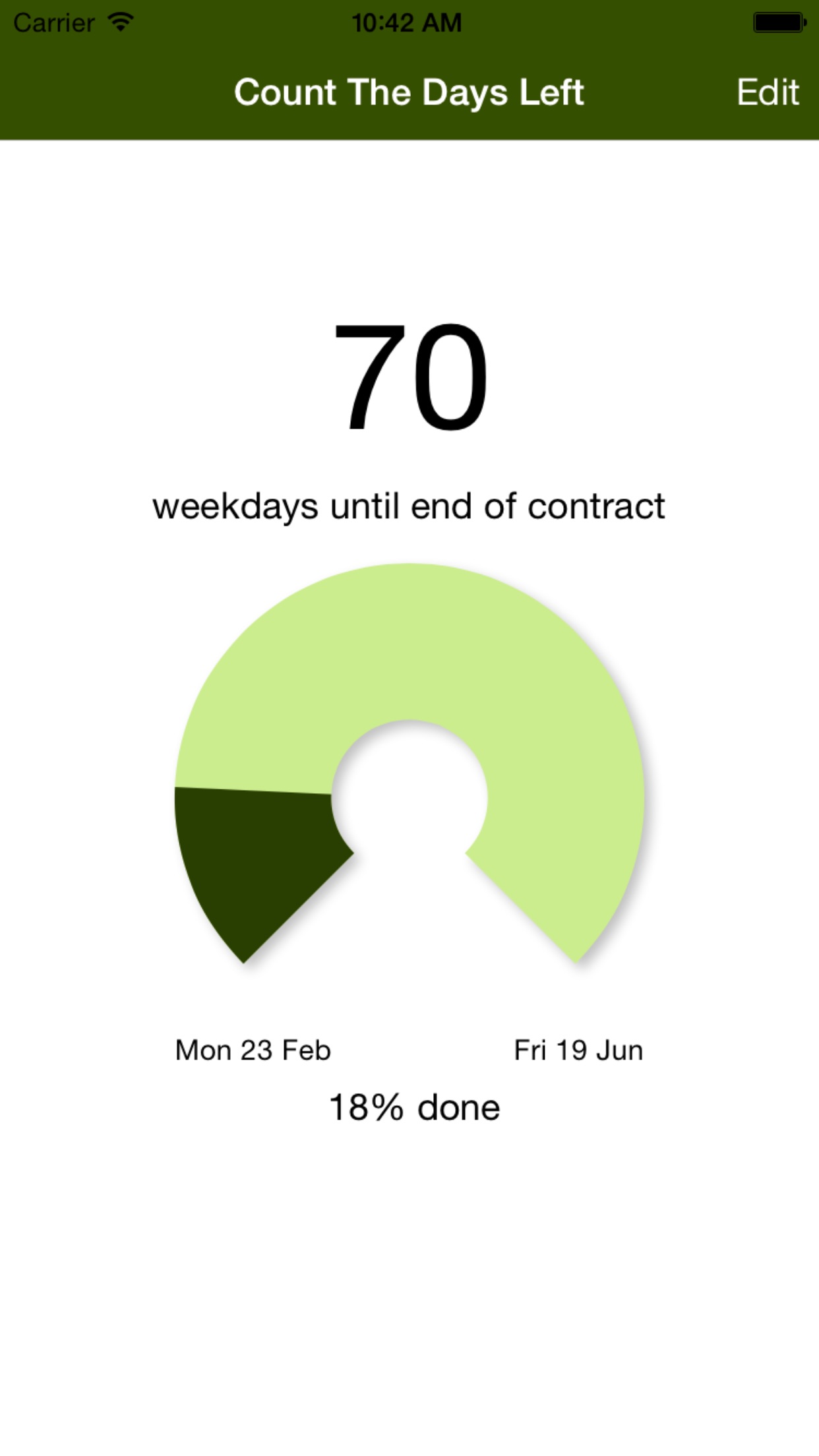
- Improved the layout of the main screen so it works better on larger screens - basically set the main control to have a fixed margin from the edge, and have a 1:1 aspect ratio rather than a fixed width and height. This means it scales better on larger screens as well as all the standard phone screen sizes.
- Added a shadow on the main control to get away from a totally flat view. Makes a surprising difference in improving the UI
Screenshots
I used the excellent LaunchKit to take the screen shots I’d take from the emulator and automatically produce the different sizes needed for the App Store. Will definitely use them again as it was efficient and quick.
Here’s what the main screen now looks like on my phone:

Next steps
- Final App Store preparations - basically the copy for the app description needs writing
- Test the beta version via TestFlight - let me know if you want an invite
- Start planning support for the Apple Watch using WatchKit
Previous posts in the series
- Plan for DaysLeft App
- Baby Steps using Swift
- Porting UserSettings Code To Swift
- Basic UI in Swift
- Writing a Today Widget in Swift
- Adding a Custom Control
- Swift and Build Odds and Sods
- Animating Progress
- Counting Weekdays Between Two Dates
The code for the project is also available on GitHub
