Getting Ready For iOS 10 Widgets
12 Aug 2016It’s summer, which means updating all the Brave Location apps for the new version of iOS.
Thankfully this year the UI changes weren’t too big, and the real work was because of how the Today widgets are changed in iOS 10.
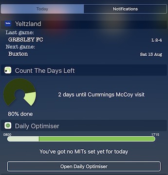
In iOS 9, the widgets are on a dark background, so it makes sense for the text to be generally white. Here’s how my stunning well-designed widgets look in the Today section on my iPad running iOS9 …

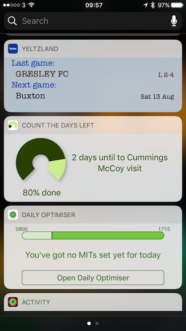
Now in iOS 10, the widgets are much more accessible - can be accessed directly by right swiping even on the lock screen - but the design has also fundamentally changed. The background is now a light, semi-transparent color by default, on which obviously the white text of the existing widget design is basically unreadable.
Now I didn’t want to have an iOS10 only release ready, as all of my apps currently target iOS 9.0 and above and I want to keep it that way for a while.
So what I do at runtime is detect whether we are iOS 10.0 or above by the following code snippet:
let ios10AndAbove:Bool = NSProcessInfo.processInfo().isOperatingSystemAtLeastVersion( NSOperatingSystemVersion(majorVersion: 10, minorVersion: 0, patchVersion: 0) )
I can then set the background and text colors of the widgets to appropriate for iOS 10 when necessary, buy keep the “traditional” look and feel on what will soon be legacy versions.
Quite happy with the way it’s turned out, even though I say it myself.

Updates are should all be in the App Store shortly (in case anyone else is running the iOS10 beta), and for everyone else in September I assume!
